Tooltip
To provide the user with useful information when they hover, click, focus or tap.
Anatomy
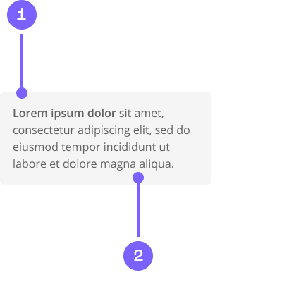
- Background
- Body
Example
Coded example
Code snippet
Figma prototype
Usage guide
Dos and don'ts
To call out the difference between similar actions.
Short descriptive message.
Make it easy to dismiss.
Don’t repeat text already on the action. Don’t overload it with detail and shadows. Keep it basic.
Hide actions in tool tips.
Long content. Should be short and to the point.