Tabs
Lets users move between sections of content.
Anatomy
- Label
- Selected State
- Hover State
- Default State
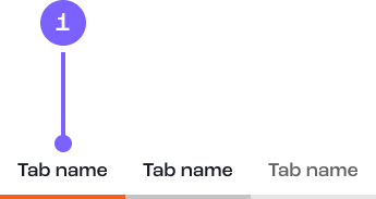
Example
Coded example
Code snippet
Figma prototype
Usage guide
Dos and don'ts
If a user needs to scan through various sections quickly.
Keep titles short and meaningful.
Content should be snappy to be scanned quickly.
Don’t use tabs for navigation as it can make pages slow to load.
Don't over use as it can devalue page ranking in search engines.
Don't use to build an application a stepper might be more appropriate.