Logos
The Payroc color logo should be used on white to lightly colored backgrounds. On darker backgrounds the reversed, white logo should be used (see below).
The Payroc logo
Primary logo

Can be used in traditional application such as print, where space isn't at a premium.
DownloadDigital logo

Use this version when needing a logo for a website, application. Anywhere online.
DownloadUsage guide
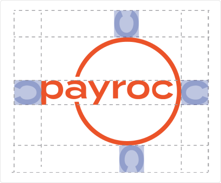
Isolation zone

Give the logo the space it needs by following the isolational area illustrated above.
Dos and don'ts
Give the logo space.
Use the correct color.
Use the correct dimensions. If it looks bad. Don't use it.
Don't use the print logo online.
Overcrowd the logo. Pay attention to isolation area.
Never stretch a logo. If it looks bad don't use it! Request marketing to look at it.