Alerts
Provide contextual feedback messages for typical user actions with the handful of available and flexible alert messages.
Anatomy
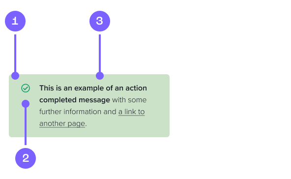
- Alert Card
- Icon
- Message
Example
Coded example
This is an example of an information alert
This is an example of a warning alert
This is an example of a positive alert
This is an example of a negative alert
Code snippet
Variants
To position the alert at the top of its parent container use the class .absolute-alert on the alert element.
<div class="alert alert-info alert-dismissible fade show absolute-alert" role="alert">
<i class="fa-regular fa-circle-info"></i>
<div class="alert-text">
This is an example of an <strong>information alert</strong>
</div>
<button type="button" class="close" data-dismiss="alert" aria-label="Close">
<span aria-hidden="true"><i class="fa-light fa-xmark"></i></span>
</button>
</div>
When including alerts as part of the body of an article, it is preferable to use non-dismissible alerts.
<div class="alert alert-info" role="alert">
<i class="fa-regular fa-circle-info"></i>
<div class="alert-text">
This is an example of an <strong>information alert</strong>
</div>
</div>
Figma prototype
Usage guide
Dos and don'ts
Keep your message short. You want a user to read these quickly.
Use the correct alert to give your message context.
Only inlcude text and links in an alert.
Overuse alerts. This can get annoying and lose their value if they are too prevalent in an application.
Change the colours or misuse the type of alerts to display other content.
Have them appear inconsistantly on different pages. Display alerts in the same places.