Accordion
Accordions are elements that help you organize and navigate multiple regions of content within a single container. They can be used for switching between items in the container based on which title the user has clicked. Our accordion is based on the Bootstrap accordion.
Anatomy
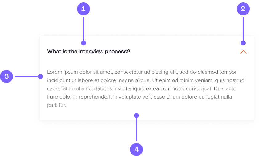
- Heading
- Collapse / Expand
- Body
- Card
Example
Coded example
Some placeholder content for the first accordion panel. This panel is hidden by default.
Some placeholder content for the second accordion panel. This panel is hidden by default.
And lastly, the placeholder content for the third and final accordion panel. This panel is hidden by default.
Code snippet
Figma prototype
Usage guide
Dos and don'ts
Use an accordion to display passages of text.
See an overview of multiple, related sections of content.
To focus users attention to a certain piece of content.
Don't use to contain applications. Use a stepper component.
Don’t hide essential information in an accordion as all users may not know how to use one.
Don’t overload an accordion with content as it can result in slow page loads.